
The Top Dos and Don’ts of Data Visualization
Your time is precious and no one wants to waste unnecessary time combing through data and drawing conclusions. Here are the top dos and don’ts for better data visualization.
Because of the way the human brain processes information, using charts of graphs to visualize large amounts of complex data is easier than poring over reports or spreadsheets.
Data visualization is a quick and easy way to convey concepts in a universal manner, and can also be used to:
- Identify areas in your business that need attention or improvement
- Clarify which factors influence consumer behaviour
- Predict sales volumes
- Pinpoint emerging trends
- Communicate your business insights and stories with others
4 KEY BUSINESS BENEFITS OF DATA VISUALIZATION
Interact With Data Effortlessly With Cadeon’s Data Visualization Services and Solutions
At Cadeon, our data visualization experts utilize a variety of tools and seamless data pipeline integration to ensure that your business data is represented in a clear, concise, and consistent manner. This allows your company to leverage information in a way that is most beneficial to you, gaining a distinct edge over your competitors.
The Dos and Don’ts of Data Visualization
Data visualization tools are a great way to create an impactful report and a well-designed report can give users an understanding of their data quickly and easily.
To help you achieve better data visualization, here are the top dos and don’ts to follow:
DO
- Make comprehension of your first priority. Remember that a beautiful infographic is of no use if a reader cannot quickly and easily comprehend the key points. Your visualization has to be informative, not just pretty.
- Have a goal in mind. Before you create a data visualization, make sure you have a specific message you want to communicate. By understanding what information you want to get across, you’ll be more likely to accomplish it.
- Keep your colours to a minimum. Too many colours can over-complicate your visuals, overwhelm your reader, and make data comparisons difficult. A good rule of thumb is not to use more than six colours in your layout.
- Use consistent colour representation. Make sure to use the same colour to represent a specific piece of data, especially if it’s appearing in multiple charts. This helps you reader see trends and better scan the overall visual.
- Utilize a hierarchy. For all your charts, make sure that your data is organized and intuitive. You may want to consider ordering your data alphabetically, by value, or sequence.
DON’T
- Try to use all your data. When creating charts or visualizations, remember that it’s quality over quantity. Data visualizations are meant to be a visual summary so try to distil your points to the ones that are most interesting, memorable, and relevant.
- Include unnecessary visual elements. Make sure to review your layout with a careful eye. Remove anything that is just purely visual and that isn’t contributing to the broader data story.
- Limit yourself to one type of chart. Select your style of chart based on the story you want your data to tell. Using the same chart for all the data is not the best approach for ensuring the reader sees your point.
- Forget to label the visual elements. Labels should be used to aid in the overall comprehension of the report. Make sure they’re short and appropriately aligned to visuals. Also, ensure they aren’t crowding or inhibiting the data.
Get The Most From Your Data Visualization
To find out more about how our team of experts and consultants can help you utilize data visualization for business growth and success, contact us at (403) 475-2494 or fill out our online contact form.
No items found.
Ready to transform your data strategy?
You might also like
.png)
AI As a Paradigm Shift
Here’s something our team has been talking about. If your organization is investing in AI—pilots, platforms, use cases—but somehow the results still feel incremental instead of transformative, then keep reading.
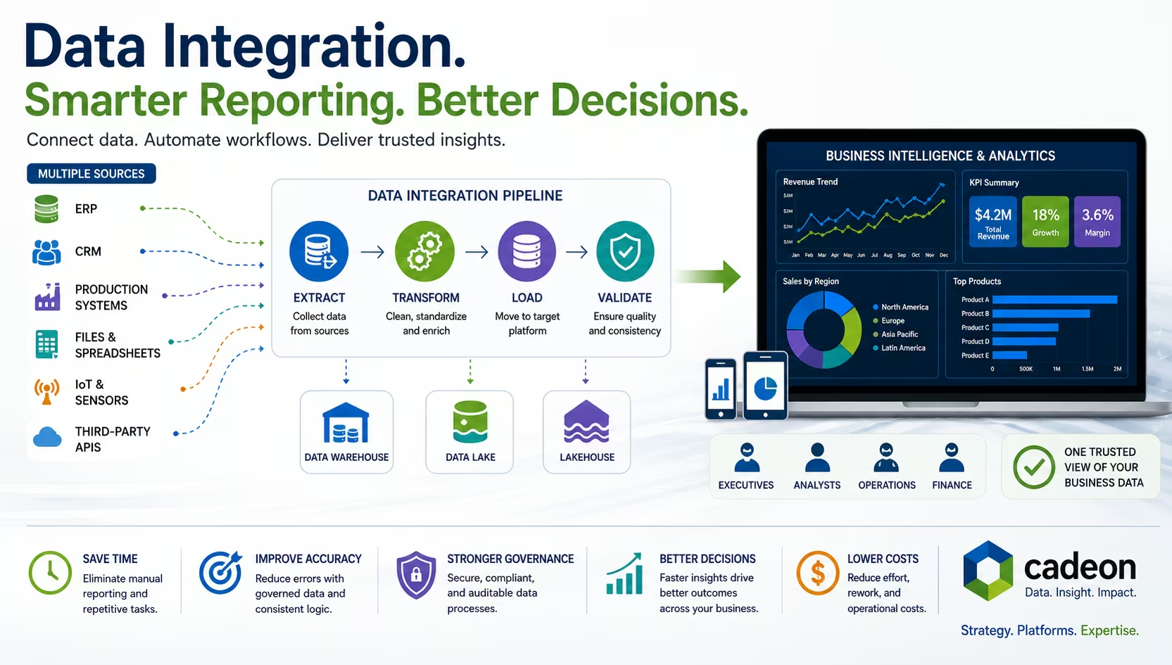
What Is Data Integration? Methods, Tools, and BI Explained