How Interactive Data Visualization Enhances Business Intelligence
Data visualizations have become essential for organizations striving to remain competitive in today’s dynamic markets. While data is often considered one of the most valuable resources, it holds little value without effective analysis and interpretation. Interactive data visualization has emerged as a transformative tool, enabling businesses to decode complex datasets and extract actionable insights with ease.This article delves into the key benefits of interactive data visualization for business analytics and explores why it has become essential for decision-making.
What is Interactive Data Visualization?
Interactive data visualization refers to the process of presenting data in graphical formats, enriched with interactive features. Unlike static graphs or charts, interactive visualizations allow users to manipulate data, explore patterns, and drill down into specific details dynamically. This method, widely endorsed by business intelligence advisors, not only enhances understanding but also supports deeper analysis.Popular tools such as Tableau, Power BI, Qlik Sense, and Spotfire—a strategic enterprise-level product—have made interactive data visualization widely accessible, revolutionizing how businesses engage with their
Simplifying Data Interpretation
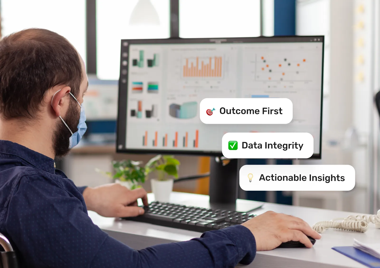
The primary advantage of interactive data visualization is its ability to simplify complex datasets. Transforming large volumes of numerical data into visually intuitive formats like bar charts, heatmaps, geographical maps, or summary tables makes trends and relationships easier to understand.For example, instead of wading through spreadsheets, a marketing manager can quickly identify sales trends or geographic areas of high customer activity through a dashboard. Business intelligence tools with interactive features—such as filtering data by time period or region—further empower users to uncover insights relevant to their goals.
Driving Data-Driven Decisions
In today’s fast-paced business environment, making timely, informed decisions is critical. Interactive visualizations support decision-making by enabling users to experiment with variables and visualize potential outcomes in real-time.For instance:
- Sales teams can forecast revenue by adjusting parameters like pricing and advertising spend.
- Operations managers can identify bottlenecks in supply chains and optimize workflows.
- Finance departments can assess the financial impact of market changes dynamically.
This dynamic exploration helps businesses anticipate challenges, seize opportunities, and act with confidence.
Fostering Collaboration and Communication
Good data visualization bridges the communication gap between technical and non-technical teams. Complex datasets, when presented as interactive dashboards, become accessible to all stakeholders, promoting collaboration.For instance, during strategy meetings, interactive dashboards allow team members to adjust parameters or explore specific metrics, facilitating productive discussions. Moreover, stakeholders can focus on insights rather than being bogged down by raw data, ensuring alignment across departments.
Real-Time Analytics and Responsiveness
In industries where conditions can change rapidly, having access to real-time analytics is a game-changer. Interactive visualization tools often integrate with live data feeds, enabling businesses to respond instantly to emerging trends or issues.Consider an e-commerce company monitoring customer activity during a flash sale. An interactive dashboard, supported by data governance software, can display real-time metrics like website traffic, sales, and cart abandonment rates, allowing the business to adjust strategies on the fly to maximize conversions.
Uncovering Hidden Patterns
One of the most valuable aspects of interactive data visualization is its ability to reveal hidden patterns in data. Advanced visualization techniques, such as clustering and heat mapping, make it easier to detect anomalies, correlations, and trends that might go unnoticed in traditional reporting.For instance:
- Retailers can analyze seasonal purchasing patterns to optimize inventory.
- Healthcare providers can identify relationships between treatments and patient outcomes.
- Manufacturers can use visualizations to pinpoint inefficiencies in production processes.
These insights often serve as the foundation for innovation and strategic growth.
Encouraging Innovation
By providing users with a flexible, interactive environment for exploring data, visualization tools play a crucial role in shaping a robust data analytics strategy. Employees can experiment with different views of the data, combine datasets, and identify opportunities that might not have been apparent otherwise. For example, a company might discover a new market segment by visualizing customer demographics alongside purchasing behaviors, sparking the development of tailored products or services.
Conclusion
Interactive data visualization, supported by seamless data pipeline integration, is an indispensable tool for businesses aiming to thrive in a data-driven world. By simplifying interpretation, enhancing decision-making, and uncovering hidden insights, it empowers organizations to turn data into a strategic advantage. As businesses face growing complexities in their operations and markets, adopting interactive visualization tools and data pipeline integration is not just a matter of staying competitive—it’s a pathway to innovation, efficiency, and sustained success.


