
Top KPI Dashboard Examples for Better Business Insights 2026
Updated on April 15, 2026 | 7 min read
If you’ve ever opened a dashboard, stared at a wall of charts, and thought, “Now what?”, you’re not alone. The best KPI Dashboard Examples don’t just look polished, they tell you, at a glance, whether you’re on track and what needs attention today.
At Cadeon, we see this daily with leaders across energy, utilities, manufacturing, and financial services. They don’t need more charts; they need sharper stories from their data. This guide walks through practical dashboard KPI examples, layouts, and use cases you can use whether you’re building in Spotfire, Power BI, or another BI platform.

Leaders quickly see whether they’re on track when KPI dashboard examples are focused and clear.
TL;DR
- KPI dashboards work when every tile answers: “Are we on track?” and “Where should we focus?”
- Start with a handful of outcome KPIs, then support them with drill-downs and diagnostics.
- Great KPI dashboard examples keep executives, operations, finance, and IT looking at the same truth.
- Tools like Spotfire let you move from static reports to interactive storytelling.
- If you’re stuck in spreadsheet chaos, Cadeon can help you design and implement dashboards in weeks, not months.
Table of Contents
- What is a KPI dashboard?
- Why KPI dashboards still matter in 2026
- How to design a KPI dashboard people actually use
- Top KPI dashboard examples & layouts
- KPI dashboard use cases by role
- Best practices & mistakes to skip
- How Cadeon helps you build KPI dashboards that pay off
- FAQ: Common questions on dashboard KPI examples
What is a KPI dashboard?
A KPI dashboard is a live, visual summary of the few key performance indicators that show whether your strategy is working. Think of it as the cockpit for your business or department: revenue, margin, safety, throughput, customer health, all in one place, updated as often as your data allows.
Unlike long monthly reports, a KPI dashboard answers two simple questions:
- Are we on plan? (targets vs. actuals)
- What needs action? (alerts, trends, exceptions)
Why KPI dashboards still matter in 2026
With AI, streaming data, and cloud warehouses everywhere, you might wonder whether dashboards are “old news.” In practice, executives and frontline teams still reach for dashboards first, because they offer a shared, stable picture before anyone starts asking deeper “why” questions.
Dashboards also help align teams that rarely sit in the same room. A field operations manager and a CFO may not agree on tooling or process, but if they both trust the same production, cost, and safety KPIs, decisions move faster and debates get shorter. Research from Harvard Business Review continues to show that organizations with clear metrics and shared visibility outperform peers that run on gut feel and offline reports.
How to design a KPI dashboard people actually use
Before we look at dashboard KPI examples, a quick design checklist. If your dashboards already exist, you can use this as a scorecard:
- Start with outcomes. Pick 5–10 KPIs that link directly to business goals: EBITDA, production volume, OPEX per unit, safety incidents, NPS, cash conversion cycle.
- Group by questions, not data sources. “Are we hitting monthly production?” is a better section header than “Historian Data.”
- Use a 3–2–1 layout. Three top-line KPIs, two trend charts, one diagnostic area with filters and details.
- Limit color. Reserve red and amber for real exceptions. If everything is red, nothing is urgent.
- Build drill-down paths. Let users click from an executive tile into site, region, or asset-level detail, especially in tools like Spotfire.
If your team is still wrestling with extracts and manual updates, our $10K Digital Transformation Challenge is a simple way to prove out an automated KPI dashboard in a fixed time and budget.
Top KPI Dashboard Examples & Layout Ideas
Let’s look at practical KPI dashboard examples you can adapt. These work across platforms; the specifics change a bit between Spotfire, Power BI, and Tableau, but the logic stays the same.

Analytics teams use KPI dashboard examples to align data sources and decision-makers across the business.
1. Executive KPI dashboard example
A strong executive dashboard fits on one screen. Think of 6–8 tiles grouped into three rows:
- Top row: Revenue vs. target, EBITDA vs. target, free cash flow.
- Middle row: Production or volume, safety TRIF, asset reliability/OEE.
- Bottom row: Customer KPI (NPS or churn), strategic project health index.
Use traffic-light status, trend arrows, and small target ranges. Executives should know in 10 seconds whether they need to call Operations, Finance, or Sales first.
2. Operations KPI dashboard example
For asset-heavy industries, operations dashboards are where the real day-to-day value sits. Typical KPIs:
- Throughput and yield by site, line, or well
- Planned vs. unplanned downtime
- Maintenance backlog and mean time between failure (MTBF)
- Energy intensity or cost per unit
In Spotfire, we often set this up with a production overview on top and a cross-filterable map or asset tree underneath. Supervisors can click from a red KPI straight into the underperforming site or unit.

Operations teams rely on KPI dashboard examples in control rooms to monitor uptime, safety, and throughput.
3. Financial performance KPI dashboard example
Finance teams need fast answers to “What changed since last month?” and “Where is the variance coming from?” A focused financial dashboard usually includes:
- EBITDA and margin vs. budget
- OPEX and CAPEX vs. plan, with variance waterfall
- Working capital days (DSO, DPO, inventory)
- Cash forecast over the next 13 weeks
Pair this with drillable visualizations so leaders can move from total variance to business unit, region, or product line in a couple of clicks. For more on this style of analysis, see our case study on Spotfire® for Organizational KPI Analysis in Real Estate.
4. Sales & marketing KPI dashboard example
Commercial teams often start with data scattered across CRM, marketing automation, and billing. A clean dashboard aligns everyone around:
- Pipeline value and coverage vs. quota
- Win rate and sales cycle length
- Marketing-sourced pipeline and MQL-to-opportunity conversion
- Churn, expansion revenue, and customer lifetime value (CLV)
The key is consistency. Your “dashboard KPI examples” here should match definitions in your CRM and finance systems so you’re not arguing over numbers each QBR.
5. Energy & asset-intensive KPI dashboard example
This is where Cadeon does a lot of work. For energy, utilities, and heavy industry, strong KPIs often combine operational, financial, and safety views:
- Production volume and utilization by field, facility, or asset
- Operating cost per BOE or per unit produced
- Unplanned downtime and reliability index
- Safety incidents, near misses, and leading indicators
One client went from multiple static reports to a single Spotfire dashboard that blends historian, maintenance, and financial data. The result: faster root-cause analysis when performance drifts and a common playbook across sites.
6. Cyber security & risk KPI dashboard example
As cyber risk grows, boards are asking more pointed questions. Security dashboards often highlight:
- Number of high/critical vulnerabilities open and closed over time
- Patch compliance by system or business unit
- Incident response time and mean time to detect (MTTD)
- Phishing test results and user training coverage
A clear visual story here helps technical and non-technical leaders meet in the middle, which aligns with frameworks from groups such as NIST.
“A useful KPI dashboard is less about how many visuals you can fit and more about how quickly someone can say: ‘Here’s what changed, and here’s what we’ll do next.’”
KPI dashboard use cases by role
Different leaders open the same dashboard with different questions in mind. A few quick examples:
- CIO / CDO: “Is our data platform stable, and are business units actually using these dashboards?”
- COO / Operations VP: “Which assets or regions are off plan today, and who owns the action?”
- CFO / Controller: “Where are we over budget, and is it volume, price, or cost that moved?”
- Business unit leaders: “Are we delivering on the KPIs we committed to this quarter?”
When you design dashboard KPI examples, write these role-based questions down first, then build layout and filters to answer them directly.
Best practices & common mistakes to skip
After hundreds of dashboard projects, a few patterns show up again and again.
Best practices
- Limit each dashboard to one main purpose: executive view, operations, finance, or project portfolio.
- Define each KPI with a clear business owner, formula, and data source.
- Use time on the X-axis wherever possible; trends tell better stories than snapshots.
- Include contextual targets: budgets, SLA thresholds, control limits.
- Document your design choices in a simple data dictionary or one-page guide.
Common mistakes
- Stuffing every metric into the same page “just in case.”
- Letting every department pick its own definitions, leading to KPI chaos.
- Building dashboards directly on unstable spreadsheets instead of curated data models.
- Ignoring change management, no training, no champions, no feedback loop.
If your dashboards suffer from these issues, our data visualization, reporting, and analytics services can help you clean up design, definitions, and data foundations.
How Cadeon helps you build KPI dashboards that pay off
Cadeon has been building KPI dashboards on platforms like Spotfire and Microsoft since 2007, with more than $300M in client value created. We focus on turning information into money, not just pretty charts.
When we work with clients, we typically:
- Clarify business goals and pick a small, high-impact set of KPIs.
- Connect and virtualize data so dashboards run on governed, reusable models.
- Design KPI dashboard examples for executives and frontline teams side by side.
- Train your users and internal champions so they can extend the work confidently.

Cadeon’s consultants work with your teams to turn KPI dashboard examples into working solutions through professional data analytics consulting in your environment.
If you’d like to see what this could look like in your environment, you can Book A Free Consult or learn more about our Spotfire consulting services.
FAQ: Common questions on dashboard KPI examples
How many KPIs should be on a dashboard?
For a top-level executive dashboard, 6–10 KPIs is plenty. Operations dashboards can include more detail, but keep the “hero” KPIs clearly separated from supporting charts.
What are some good dashboard KPI examples for executives?
Revenue and margin vs. target, cash, production/volume, safety, reliability, and a customer metric (NPS or churn) form a strong base set. You can add one or two strategic KPIs tied to current initiatives.
Which tools are best for KPI dashboards?
We see a lot of success with Spotfire in asset-intensive industries, alongside platforms like Power BI and Tableau. The right choice depends on your existing stack, data sources, and governance needs. Analyst firms such as Gartner publish overviews of the BI landscape if you’re comparing vendors.
Key takeaway
Great KPI dashboards aren’t about squeezing in more visuals. They are about giving every leader and frontline team the same clear line of sight from strategy to daily action. Start with a few well-chosen KPIs, support them with thoughtful layout and drill-downs, and your dashboards will finally earn their keep.
Ready to transform your data strategy?
You might also like
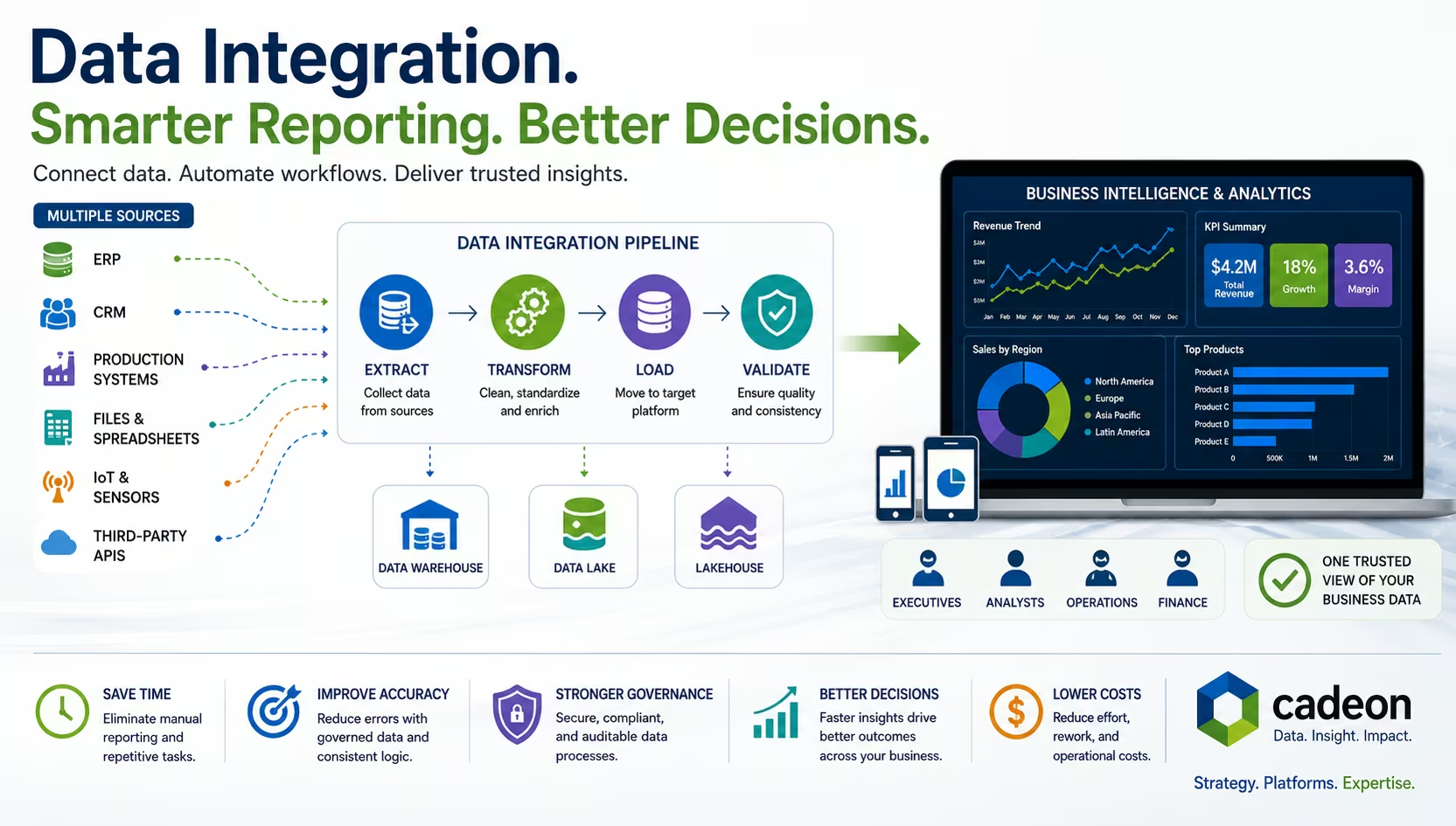
What Is Data Integration? Methods, Tools, and BI Explained
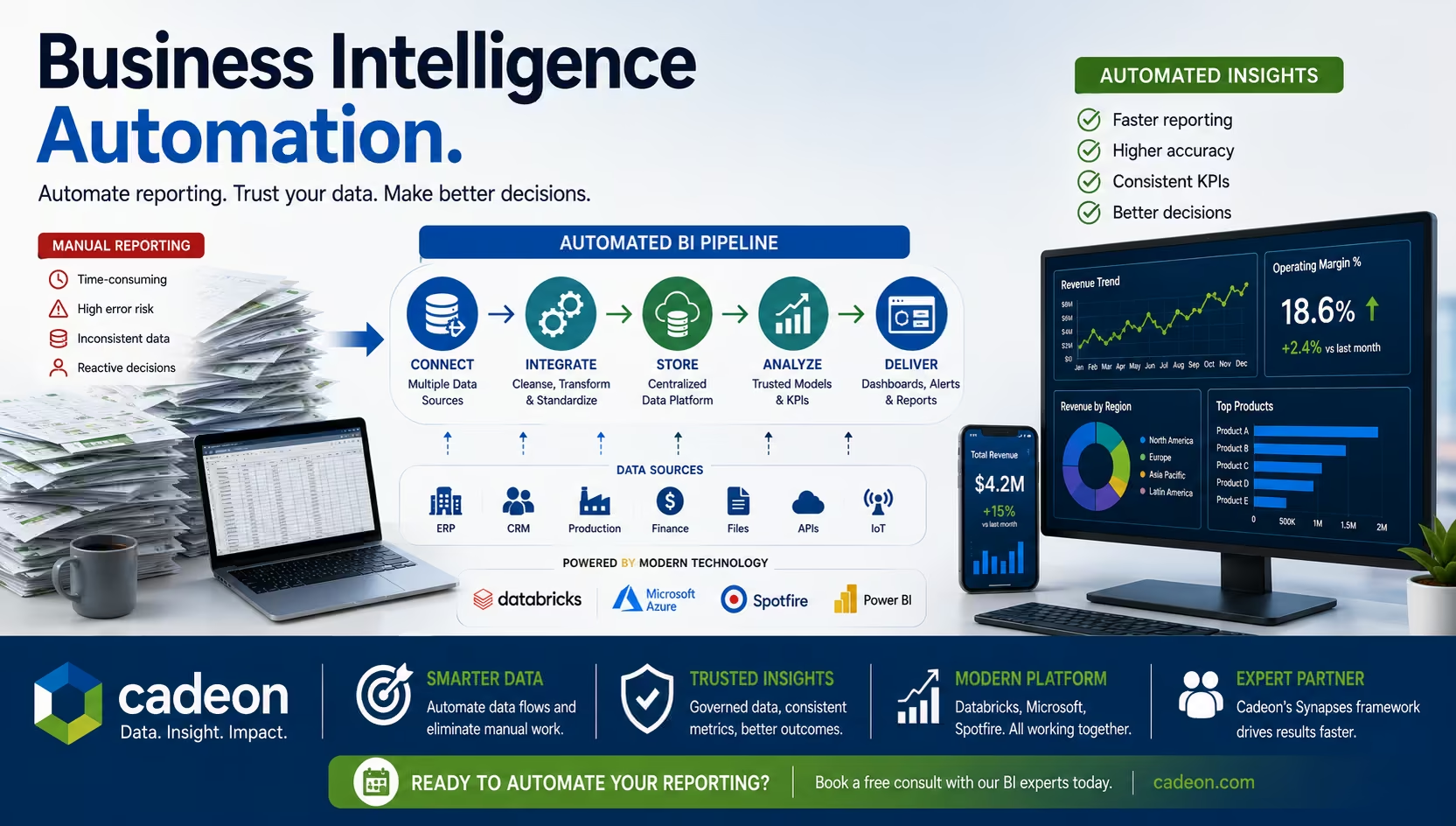
Business Intelligence Automation for Faster Reporting & Insights