Using Visualization for Real-time Performance and KPI Monitoring
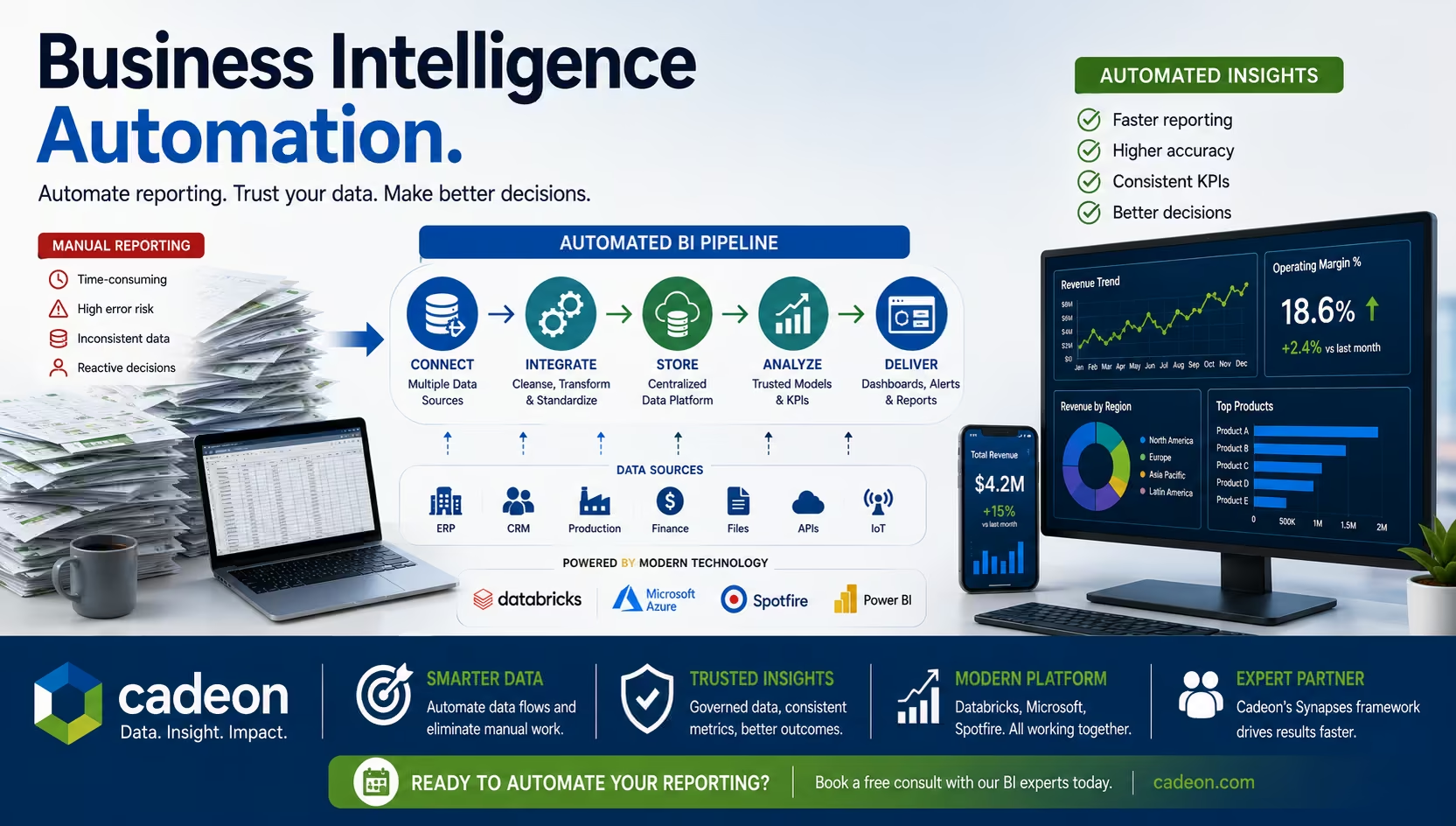
In today's fast-paced business environment, real-time performance tracking is no longer a luxury—it's a necessity. Businesses need accurate, actionable insights to stay competitive. Visualize data effectively to turn complex datasets into digestible visuals, making decision-making more efficient and strategic. Visualization tools play a critical role in this transformation.
Why Real-time Monitoring Matters
Real-time performance monitoring offers immediate insights into operations, sales, and customer behavior. Unlike static reports, it enables organizations to respond to challenges as they arise. For example, a retail company can adjust inventory based on live sales data, preventing stock shortages or overstocking.Timely insights also enhance productivity. Managers and teams can identify bottlenecks, improve workflows, and align efforts with organizational goals. Among the various data visualization types, interactive dashboards stand out for their ability to highlight trends and foster informed decisions.
The Role of Visualization in KPI Tracking
Data visualization simplifies complex metrics by presenting them in an understandable format. Charts, graphs, and dashboards allow teams to grasp trends and performance metrics at a glance. This clarity fosters informed decision-making and reduces the risk of errors.In particular, Visual Data Scientists are essential for creating effective visualizations. These experts leverage advanced tools to transform raw data into actionable insights, ensuring businesses make informed decisions.
Choosing the Right KPIs
Not all KPIs are created equal. Effective monitoring begins with selecting metrics that align with business objectives. Focus on KPIs that offer actionable insights rather than overwhelming teams with unnecessary data.Visualization tools can highlight relationships between metrics. The visualization of data reveals underlying patterns and opportunities for improvement, helping teams prioritize their efforts effectively.
Key Features of Visualization Tools
Modern visualization tools offer a wide range of features that enhance real-time performance tracking. Some of the most valuable include:
- Customizable DashboardsDashboards should cater to different user needs. Executives might need an overview of company performance, while team leaders require detailed metrics.
- Integration with Data SourcesSeamless integration with CRM systems, databases, and third-party tools ensures that visualizations remain up-to-date.
- Alerts and NotificationsAutomated alerts notify teams of significant changes or deviations from expected performance, allowing for immediate action.
- Collaboration ToolsSharing dashboards and insights fosters collaboration across departments, ensuring alignment on goals.
Good visualization tools enhance usability and create good data visualization, which simplifies complex metrics while highlighting trends effectively.
Best Practices for Effective Visualization
To maximize the benefits of visualization, follow these best practices:
- Keep it SimpleOverloading dashboards with too much information can overwhelm users. Focus on clarity and relevance.
- Use the Right Chart TypesBar charts, line graphs, and pie charts serve different purposes. Match the chart type to the data being presented.
- Highlight Key MetricsUse color coding and annotations to emphasize critical data points. This draws attention to areas that require action.
- Ensure Mobile CompatibilityMany professionals work on the go. Dashboards optimized for mobile devices allow users to access insights anytime, anywhere.
Modern data visualization platforms provide these features while ensuring users can adapt their dashboards to fit specific needs.
Real-world Applications of Visualization
Visualization tools have transformed industries by enabling better decision-making. Here are a few examples:
- HealthcareHospitals use dashboards to monitor patient flows, resource allocation, and staff performance. Real-time tracking ensures optimal care delivery.
- E-commerceOnline retailers track website traffic, conversion rates, and inventory levels. Visualizations help identify trends and improve the customer experience.
- ManufacturingProduction managers monitor machine performance, output rates, and quality control metrics. Visual insights reduce downtime and improve efficiency.
Overcoming Challenges in Real-time Monitoring
Implementing real-time monitoring comes with challenges. Integrating multiple data sources can be complex. Ensuring data accuracy is equally critical, as flawed inputs can lead to incorrect conclusions.Training teams to interpret visualizations effectively is also essential. While tools make data more accessible, users must understand the context behind the numbers.
The Future of KPI Monitoring
Advancements in technology will continue to enhance real-time performance tracking. Artificial intelligence and machine learning will play a pivotal role in predictive analytics, identifying trends before they occur. Augmented reality dashboards may also emerge, providing immersive and interactive ways to explore data.In addition to these innovations, advanced monitoring systems will include real-time alerts for operators, enabling the early detection of potentially hazardous conditions. By proactively informing personnel about risks, organizations can prevent incidents and mitigate operational threats, fostering a safer and more reliable working environment. Organizations that adopt these innovations will gain a competitive edge. The ability to anticipate changes, prevent risks, and act swiftly will define success in an increasingly dynamic market.
Conclusion
Visualization is revolutionizing how businesses monitor performance and KPIs through seamless data pipeline integration. By presenting data in clear, actionable formats, it empowers teams to make informed decisions quickly. Real-time tracking fosters agility, aligns efforts with goals, and drives better results. Embracing Spotfire tools, visualization tools, and data pipeline integration is not just a strategic advantage—it’s a necessity for staying ahead in today’s data-driven world.

No items found.
Ready to transform your data strategy?
You might also like
.png)
AI As a Paradigm Shift
Here’s something our team has been talking about. If your organization is investing in AI—pilots, platforms, use cases—but somehow the results still feel incremental instead of transformative, then keep reading.
What Is Data Integration? Methods, Tools, and BI Explained